
pale blue dot
2D Animation & Design – Lee Beauchamp
Music – ‘Agape’ by Nicholas Britell
Speech (edited) -Carl Sagan
Voice over – Kolten Webber
After Effects, Illustrator
the brief
With an emphasis on typography, utilize Carl Sagan’s speech of the “Pale Blue Dot” to create a less than 60s long animation, invoking a sense of wonder and awe.




concept
The real question was how to play around with typography without it being a word slog fest. Sagan’s speech had to be trimmed down to only a minute, so it was vital that the most essential parts and essence of the piece remained in the final version.
I wanted to make sure these two complexities came across:
- the spirit of being in self-aware of how small we are in relation to everything in the universe
- committing that self-realization to a sense of camaraderie with one another
As the speech is edited, I employed the help of a friend (shoutout Kolten Webber) for the voiceover. This would help focus the viewer on few words shown on screen for emphasis, while still getting the overall speech and message across.
development
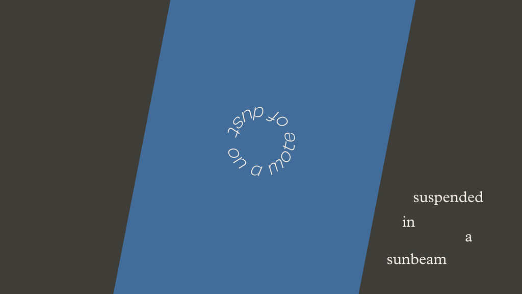
As typography was the main focus, going for simplicity with a flat 2D design could further emphasize the words and meaning. The styleframes heavily rely on abstraction to not divert attention away, but still alludes to the overall theme of humanity and space with simple shapes.

This style frame in particular is a reference to the original Voyager 1’s Pale Blue Dot Image in 1990. For those unfamiliar with the picture, the voiceover includes the line describing it.

Here is another abstract design choice: a reference to a lighthouse. A lighthouse serves as a beacon, a waypoint for those out in the abyss.
Here the light beams re-emphasize the truth about our identity in The Pale Blue Dot, as humans exploring space. The word ‘help’ and ‘ourselves’ are the only ones illuminated by the beams.
No one can save us from the consequences of our own actions, except ourselves. Recognize this and commit to helping one another because we are all we have.
I delve more into detail of visually designing style frames here.
refining motion
The first pass of motion hit the concept of the speech, but fell flat on connecting each emotional beat to one another.
commit to the mic drop
The final moments of the first pass felt disconnected from one another, which diluted the ending words of the speech. The semi-circle design felt awkward, ‘preserve and cherish’ was out of place, and the ‘pale blue dot’ reveal was lackluster.
To fix it, the answer lay in honoring the circular motif of the Pale Blue Dot. Semi-circles evolved into full rings, ‘preserve’ and ‘cherish’ followed a circular motion, and the reveal of the title was kept simple to emphasize the blue dot in center stage.
small details you’d never notice (unless I made you look at them)
Small details matter! The first pass transition here felt abrupt. Making the dot’s entrance smoother and adding anticipation before the main sequence better connected the scenes.
transitioning visually demanding scenes
The challenge here was seamlessly transitioning one design heavy style frame to another with a different colored background. The initial motion pass left the cut jarring, breaking up the sentence that was already building.
The solution was to integrate a piece of the next frame into the previous, using the graphics to reveal the ‘mote of dust’. The solid color blue introduction became a matter of a shape transition, respecting the circular look of the focal point.
side by side comparison
watch it again!
thanks for watching 🙂